【Tags】
Ode to the Dinkus
Arts & Culture
The heaventree of stars hung with humid nightblue fruit … a mobility of illusory forms immobilised in space —James Joyce, Ulysses
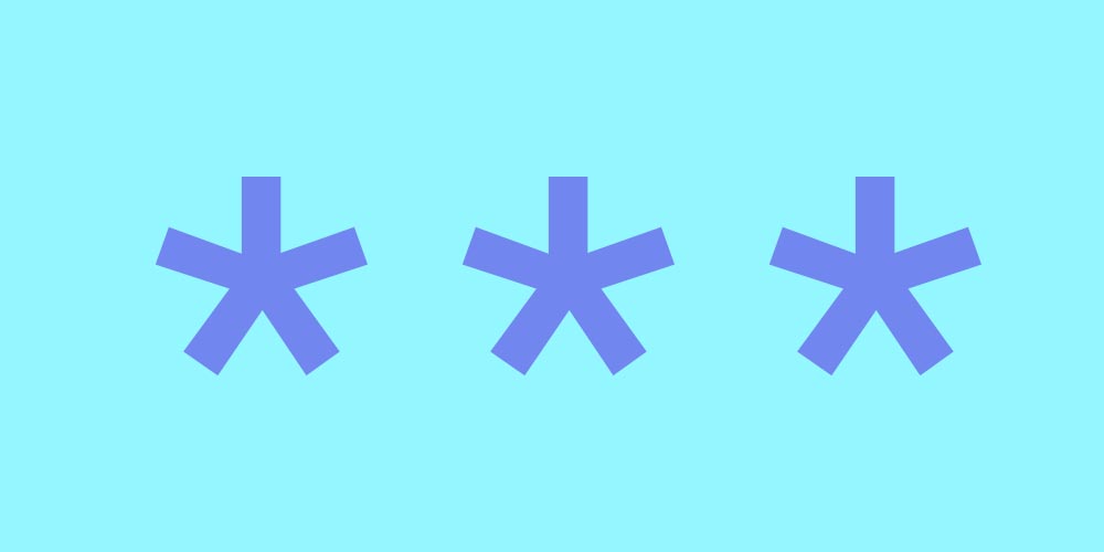
Three months ago, I was a normal person. Now all I think about 24-7 is the dinkus. Did you know that dinkusesis an anagram of unkissed? I did. For the uninitiated, the dinkus is a line of three asterisks (* * *) used as a section break in a text. It’s the flatlining of an asterism (⁂), which in literature is a pyramid of three asterisks and in astronomy is a cluster of stars.
The dinkus has none of the asterism’s linguistic association with the cosmos, but that’s why I love it. Due to its proximity to the word dingus, which means, to define one ridiculous word with another, “doodad,” dinkuslikely evolved from the Dutch and German ding, meaning “thing.” To the less continental ear, dinkussounds slightly dirty, and I can confirm that it’s brought serious academics to giggles.
For me, a writer and reader, its crumbiness is its appeal. I need some crumbs to lure me down the page. This is especially true when I read online, where the chance of distraction is high. Fortunately, plenty of websites have filled their text breaks with a unique dinkus of their own. At The Awl (now defunct), text was broken up by a tiny awl. (At The Awl’s sister site The Billfold, it’s a billfold.) Over at The Outline, squiggles guide the eye from section to section like rubbery fishing lures. Hazlittand Lit Hubemploy a single asterisk aligned to the left margin.
The radical flexibility of the dinkus online, in service of branding, is similar to how James Joyce used typographic elements as chapter signifiers in his epic Ulysses. “Wandering Rocks,” for example, is the sole chapter to use a dinkus—but only in the 1984 Hans Walter Gabler edition. In the original 1922 edition, the space is occupied by an asterism. When Vintage Books reissued Ulysses in 1990, they used a hollow white star. “Typography in Joyce is always pointing to some dimension of the materiality of language,” said Nicholas Andrew Miller, an associate professor at Loyola University Maryland. “Typography is a way of reminding readers to pay attention to every mark.”
The stubborn Joyce fought with French printers to keep an ambiguous dot that appears at the end of the “Ithaca” chapter of Ulysses. Although he never elucidated its meaning, he wrote letters asking his publishers to make it more visible. Over the past ninety-six years, Joyce readers and scholars have brought their own interpretations to this mark. “Ithaca” is structured as a series of questions, the last question being: “Where?” In the space beneath “Where?,” the mark offers its own answer and obfuscation.
* *
*
Allow me to answer your pressing questions.
How old is the asterisk?
According to Keith Houston—the author of Shady Characters: The Secret Life of Punctuation, Symbols, and Other Typographical Marks (W. W. Norton & Company, 2013)—the asterisk traces back to Aristarchus of Samothrace, a grammarian and director of the Library of Alexandria. The asterisk, obelus, and diple—all symbols used by translators for marking up Homer—are still referred to as Aristarchean symbols.
Many pictures and symbols have been used as a dinkus, each with their own names. For example, the fleuron (❧), which consists of a leaf or flowerlike glyph. The humorist P. G. Wodehouse referred to the dinkus as a “zareba” in his short story “Something to Worry About.” (“The novelist blocks his reader’s path with a zareba of stars.”)
What is a zareba?
A zareba is an enclosure for cattle in northeastern Africa. I cannot tell you more than that, though a stray post on an Internet message board claims, “I have heard that construct (a line of asterisks meant to suggest a temporal or logical disconnect) described as a ‘zareba,’ back in my days as a typesetter, but I am unable to find a reference for that usage, even in the venerable OED—it may have been local to SF Bay typesetters, or just used by typesetters in general.”
When words made the jump from the page to the Web, the asterism had a new raison d’etre. Within the idiosyncrasies of the Web, there’s a danger that a section break consisting of white space alone could be misinterpreted as an error. As Marcin Wichary, the former design and typography lead at Medium, told me, “Sometimes a lack of something might not register as a deliberate decision but rather be interpreted as a page that didn’t finish loading or a missing image or ad or something else having gone wrong.”
“Asterisms, fleurons, and the like would have been too formal,” he continued. “So was left-aligning whatever glyph we came up with. In the end, the centered three gray dots seemed the most pleasing and neutral, without veering too much into informality.”
As Nick Sherman, the typographer, web designer, typeface designer, and typographic consultant, explains, the dinkus is a character, not a glyph. For example, a lowercase a is a character, but variations on the letter in Times New Roman or Helvetica represent two different glyphs. “The idea of a dinkus is basically just a break in the text. You don’t necessarily have to look one way or another,” Sherman said. This is in contrast to the asterism, that pyramid of asterisks, which gets its own character in Unicode with a very clear description of how it looks.
What sound does a dinkus make?
Sherman was kind enough to test this with the native screen-reading function of macOS. When the reader came to the Unicode ⁂, it said “asterism” aloud. However, when it came to the dinkus (* * *), it said, “Asterisk, asterisk,” before moving on to the next section.
Is Asterisk, Asteriska novel by Faulkner?
No, but it should be.
* *
*
I think about the dinkus on the train, observing a smattering of stars tattooed on a fellow straphanger. I think about the dinkus while packing up my bedroom for a recent move, finding a cache of glow-in-the-dark stars I’ve carted from apartment to apartment and arranging them in a familiar pattern of three. The dinkus is a success story: it survived the jump from printed media to the Web. Now it’s even traveling from Web back to print (hallelujah).
The designer and writer Jarrett Fuller just finished designing a book of collected essays that originally appeared online. “We wanted the book to feel like the website but to also have a book quality to it, so we stripped out a lot of the images,” Fuller explained. “There are no indents. It’s all line breaks for the paragraphs. Typographic flourishes are kept minimal to feel more like a website.” Of these flourishes, the dinkus made the cut.
“I’ve seen people complain, Why is this three-asterisk thing so overused?” said Jess Zimmerman, the editor in chief of Electric Literature. “I think one of the objections is that it feels self-consciously literary. But it is.” Zimmerman designed Electric Literature’s section break herself: two lightbulbs connected by a sinewy wire. “Things that are tools for us as writers are also things that we can lend to the reader as a way of showing them how to read the piece.”
“The Web is infinite, and you can just continue a page forever; you can go into infinity. [The dinkus] is an interesting kind of return to an old paradigm,” said Maria McGarrity, a professor of English at Long Island University and a Joyce scholar. McGarrity points out that Joyce’s interest in aligning Ulysses to Greek classicism, even insisting that the blue of the original edition’s cover match the hue of the Greek flag, has been somewhat lost to his overbearing reputation as a Modernist.
Given the asterisk’s early use as a mark to facilitate the translation of the Iliadand Odyssey, Joyce’s asterisks may have been a nod to the classics. Much like the stars, the dinkus is a point of navigation.
Daisy Alioto is a writer and dinkus influencer living in the Hudson Valley.
Search
Categories
Latest Posts
AMD Radeon RX 550 + Intel Pentium G4560
2025-06-26 03:20Tesla's 'Full Self
2025-06-26 02:22What Prop. 22 could mean for the gig economy nationwide
2025-06-26 02:19Best Garmin deal: Save over $100 on Garmin Forerunner 955
2025-06-26 01:17Popular Posts
Hurricane Laura's impact lingered with nightmarish mosquito swarms
2025-06-26 03:35Twitter puts warning label on Trump's false election tweet
2025-06-26 02:51Little girl's first 'magic trick' fools no one but the dog
2025-06-26 02:05Featured Posts
'The Last of Us' Season 2, episode 4: Why Ellie sings 'Take on Me'
2025-06-26 03:09Little girl's first 'magic trick' fools no one but the dog
2025-06-26 01:39Popular Articles
Best robot vacuum deal: Eufy Omni C20 robot vacuum and mop at record
2025-06-26 03:06People are promising to post their nudes if Biden wins Texas
2025-06-26 02:23New MIT report reveals energy costs of AI tools like ChatGPT
2025-06-26 01:00Newsletter
Subscribe to our newsletter for the latest updates.
Comments (682)
Warmth Information Network
Astronomers saw one galaxy impale another. The damage was an eye
2025-06-26 03:32Fresh Information Network
Amber Heard serves sweet, sweet revenge on politician who kicked her dogs out of Australia
2025-06-26 03:23Wisdom Convergence Information Network
The Gap's hilariously bad unity sweatshirt accidentally unites people who hate it
2025-06-26 03:08Exquisite Information Network
Australian dad finds venomous snake just chilling next to baby's crib
2025-06-26 02:41Original Force Information Network
SpaceX's Starlink satellite launch in pictures
2025-06-26 01:00